Atir Cycles Brand Update
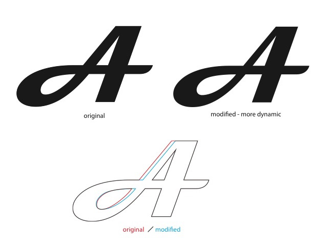

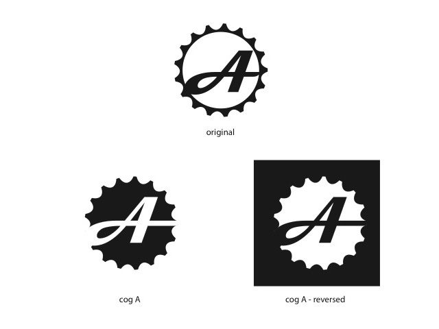
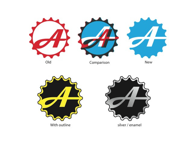
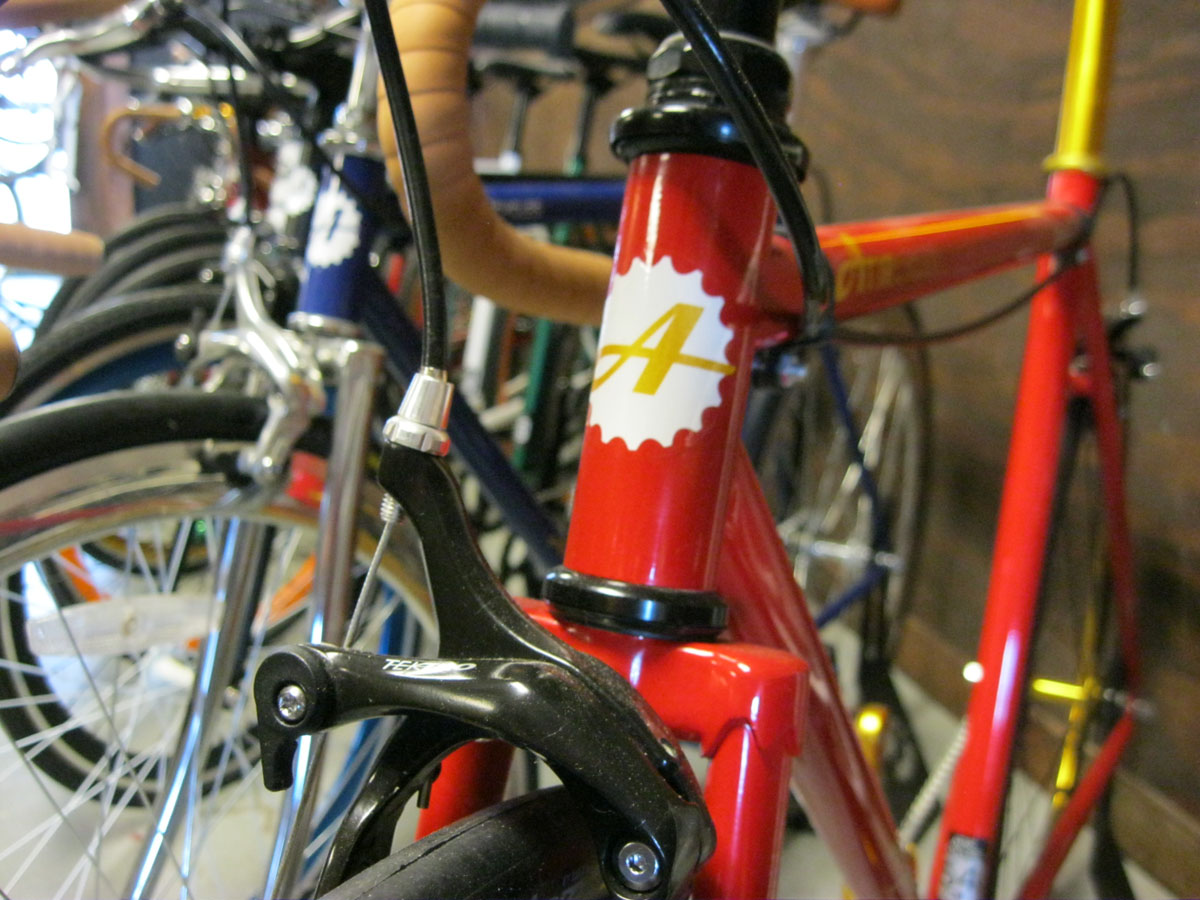
Atir Cycles hired me to help update their brand. Starting with the “A”, I revised the logo to have more character and have a bit more dynamic quality. I revised the word-mark to match the italicized lean of the “A” and tightened up the kerning. I revised the circular A logo to have more of a solid presence by enlarging the A and giving it a solid field to set against, while maintaining the original cog shape.

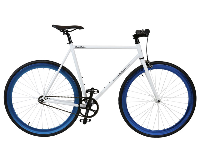
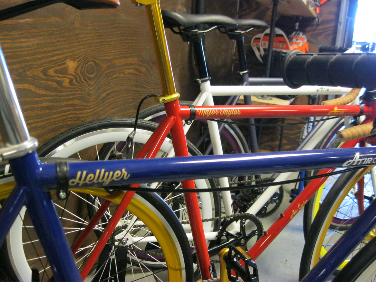
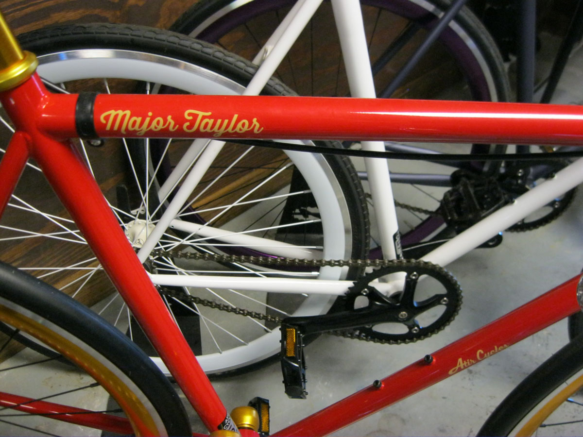
In addition to the main branding refresh, I created a modified script logo for use on a new line of bicycles, labels for such, frame size stickers, bike box layout updates and wheel box updates.
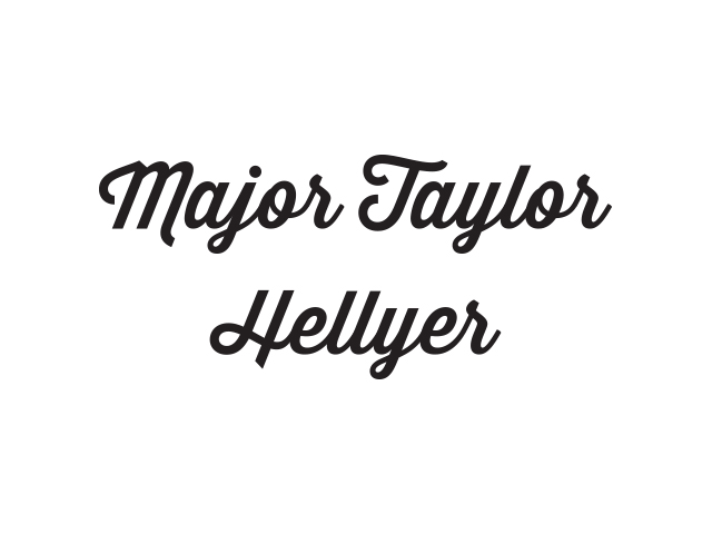

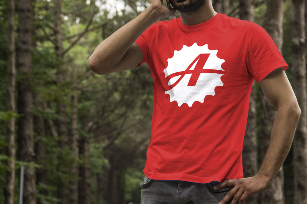
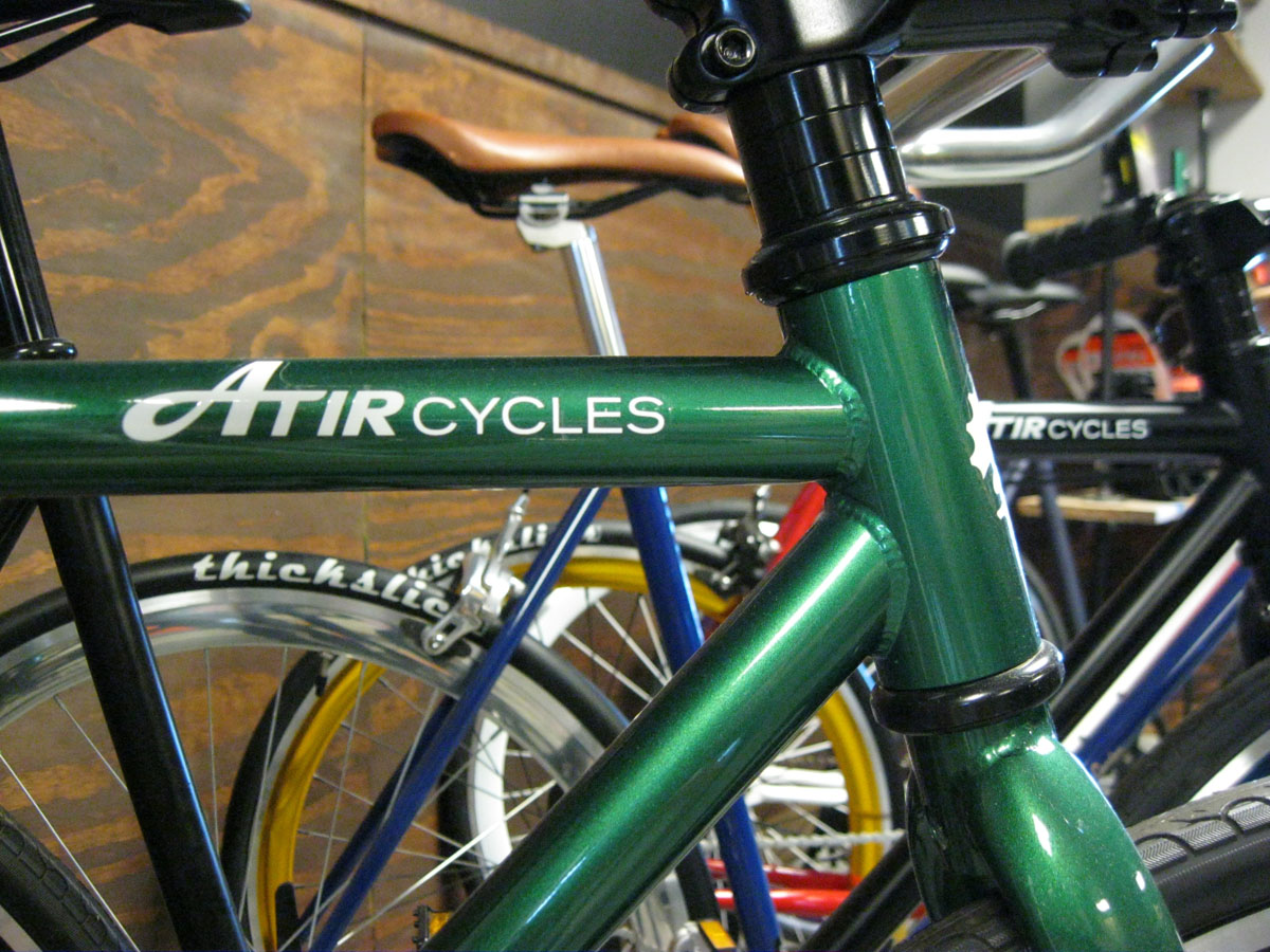
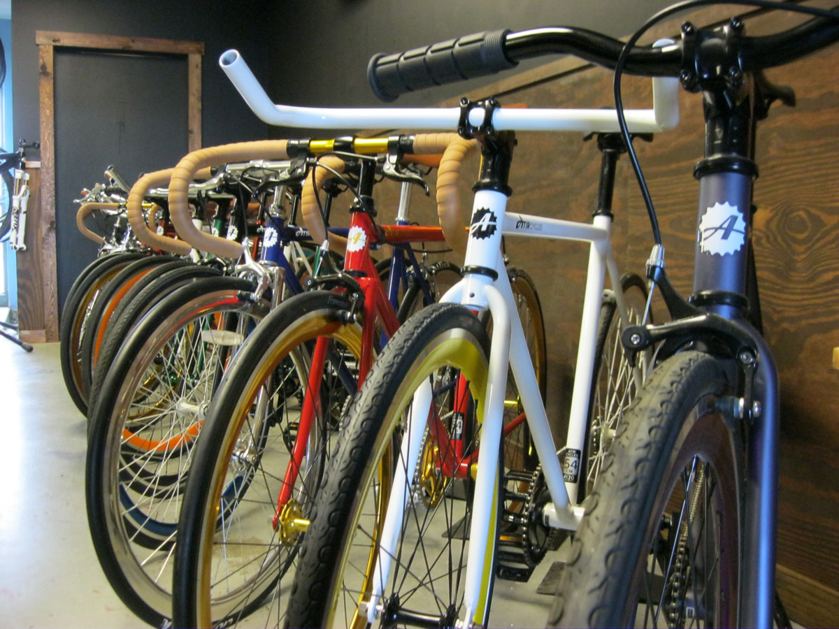
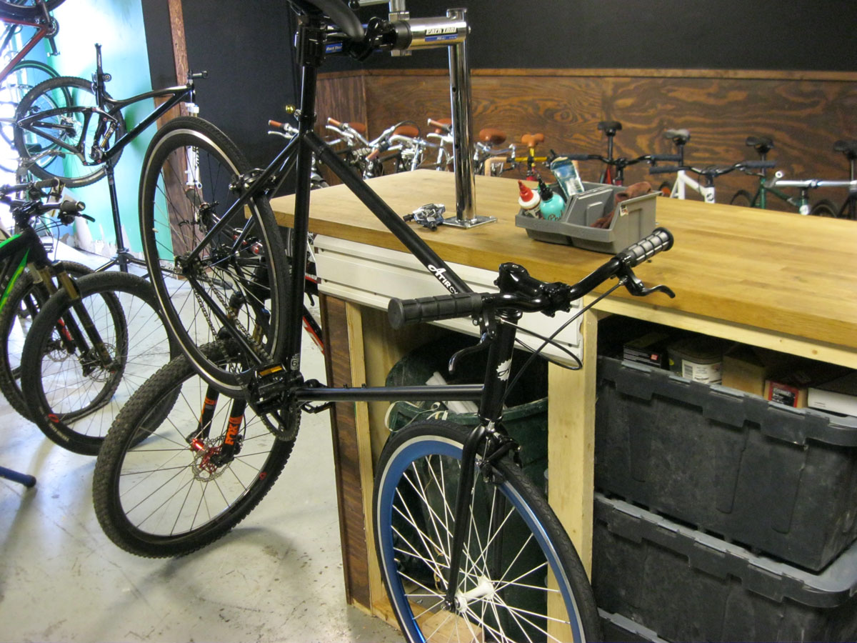
Photos of the branding on bikes:
Box layouts.
Not sexy, but necessary:


Like what you see?
Contact me today and we can get started on your project soon.