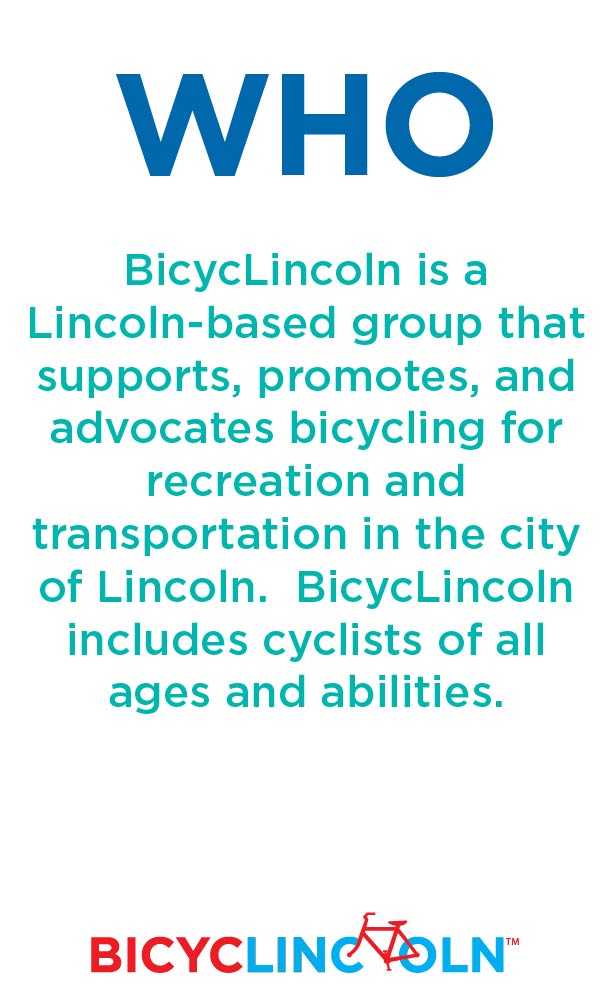
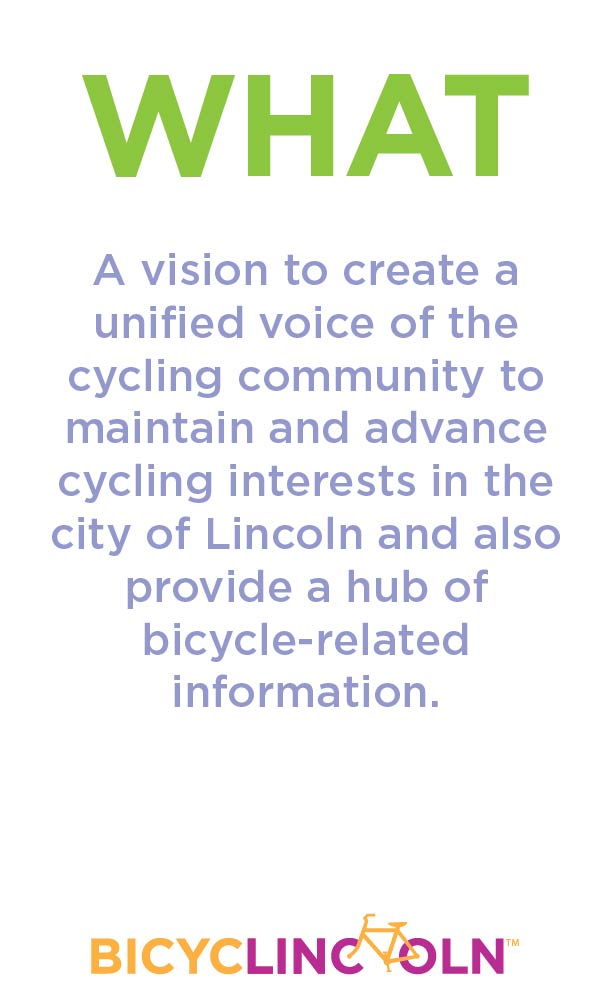
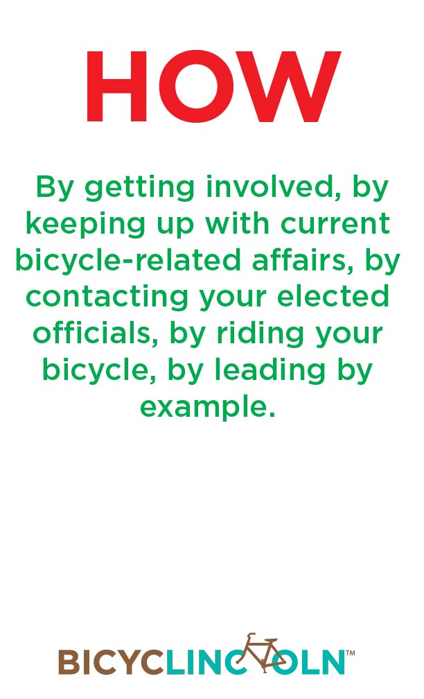
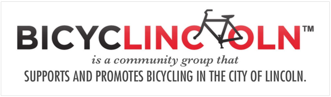
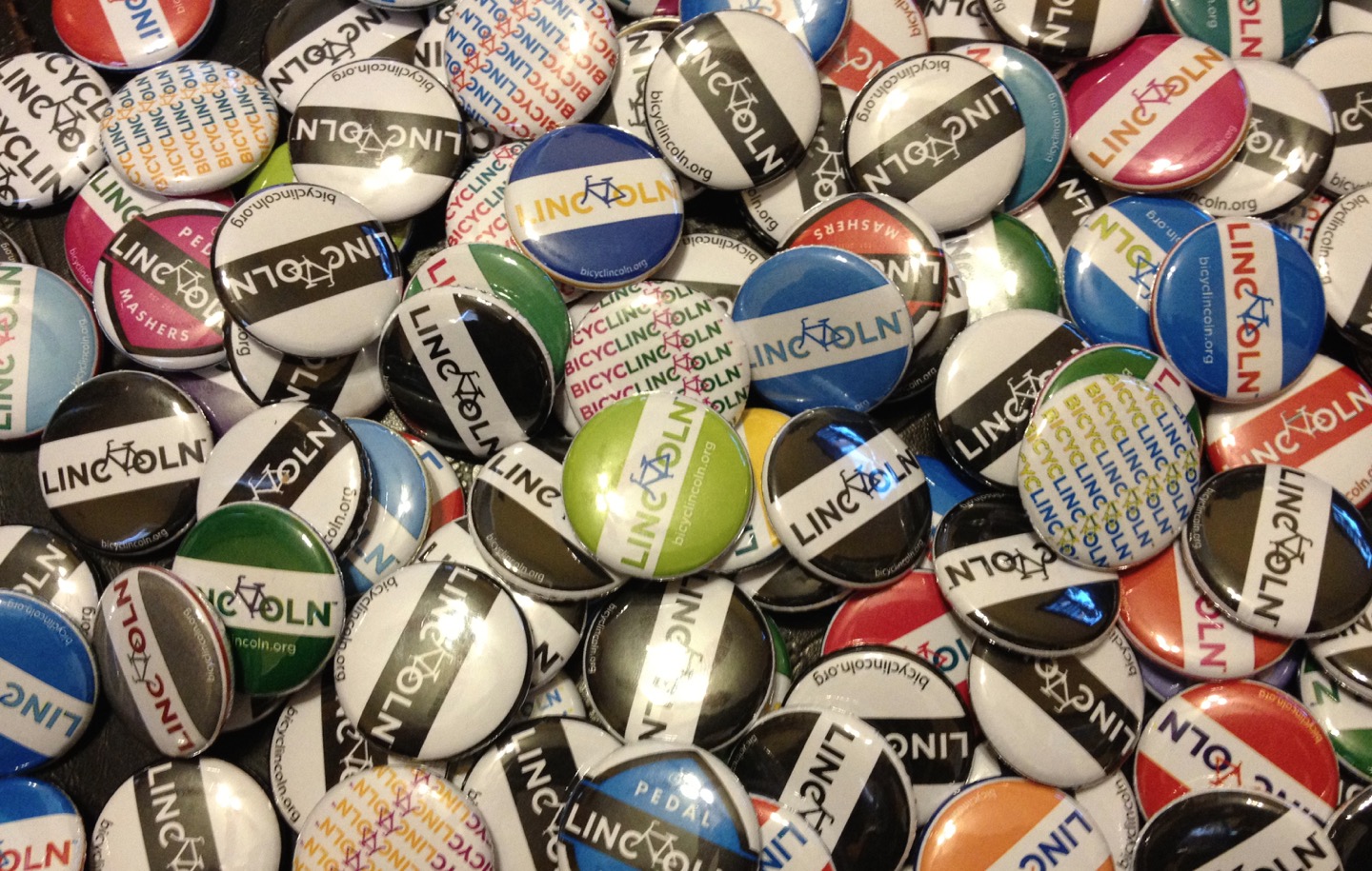
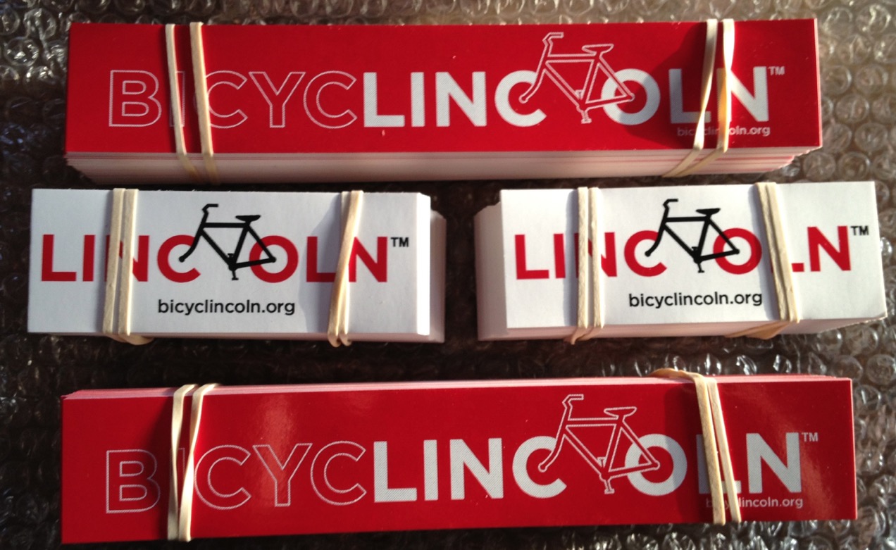
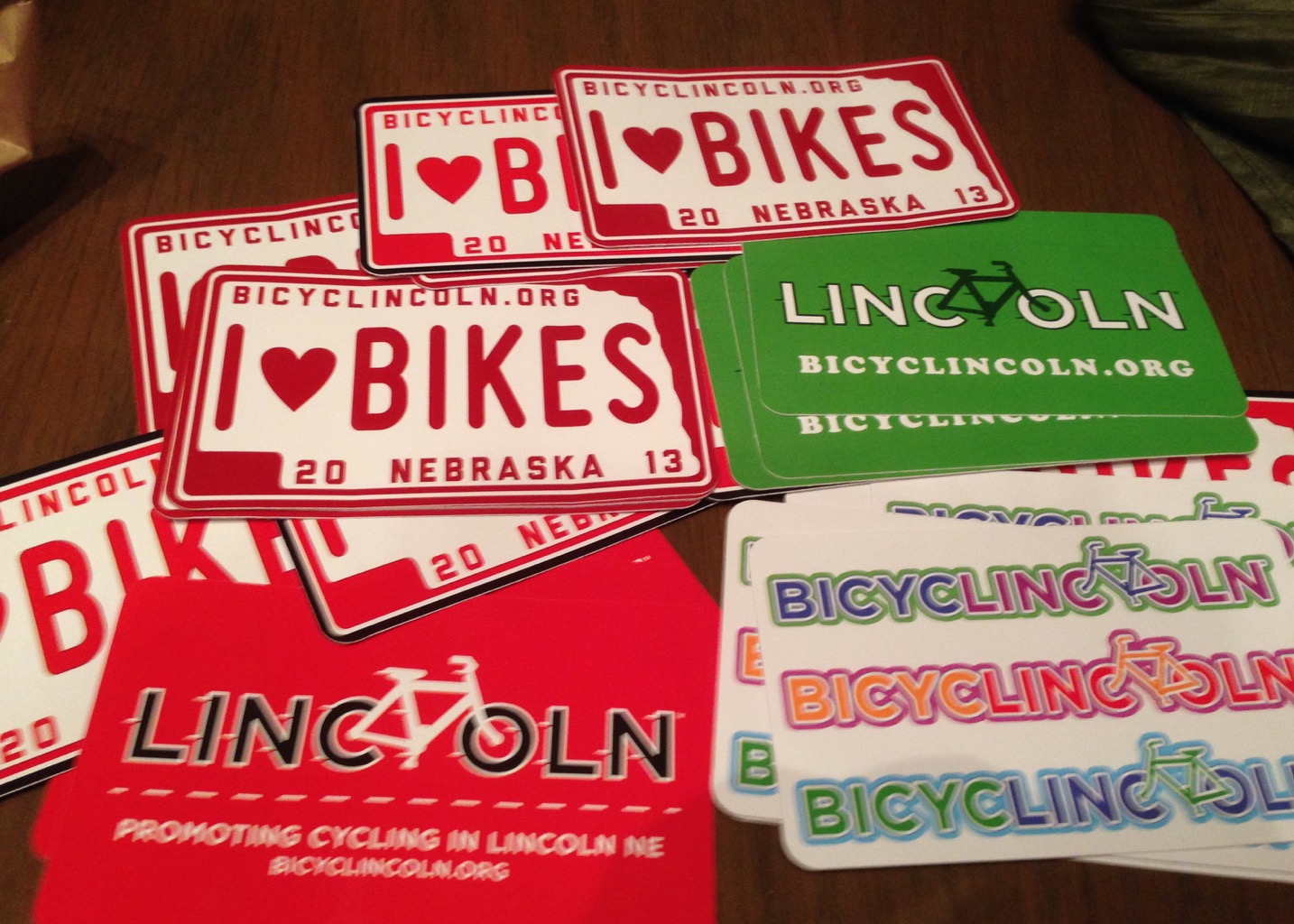
BicycLincoln Brand Creation
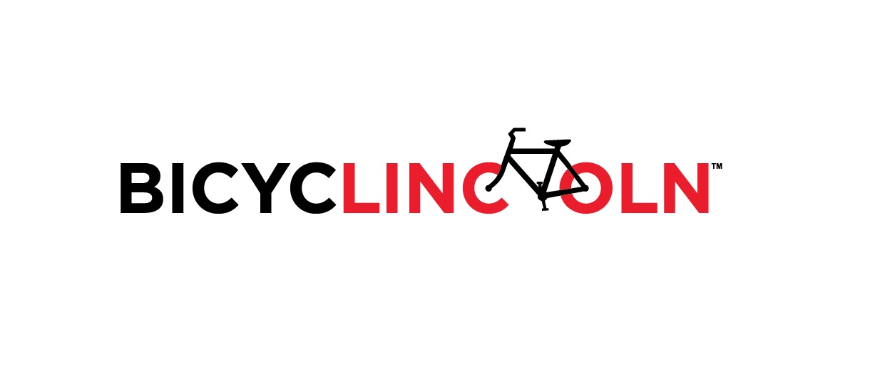
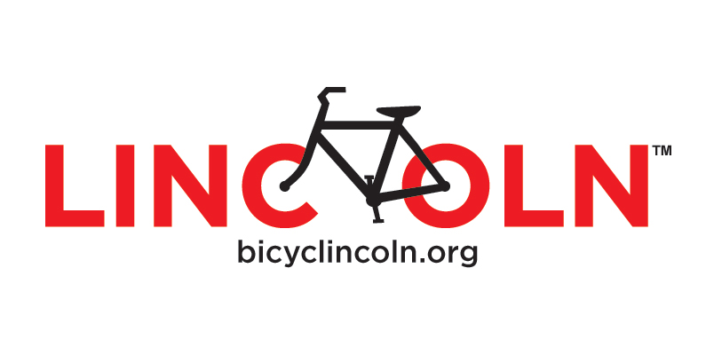
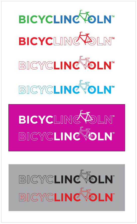
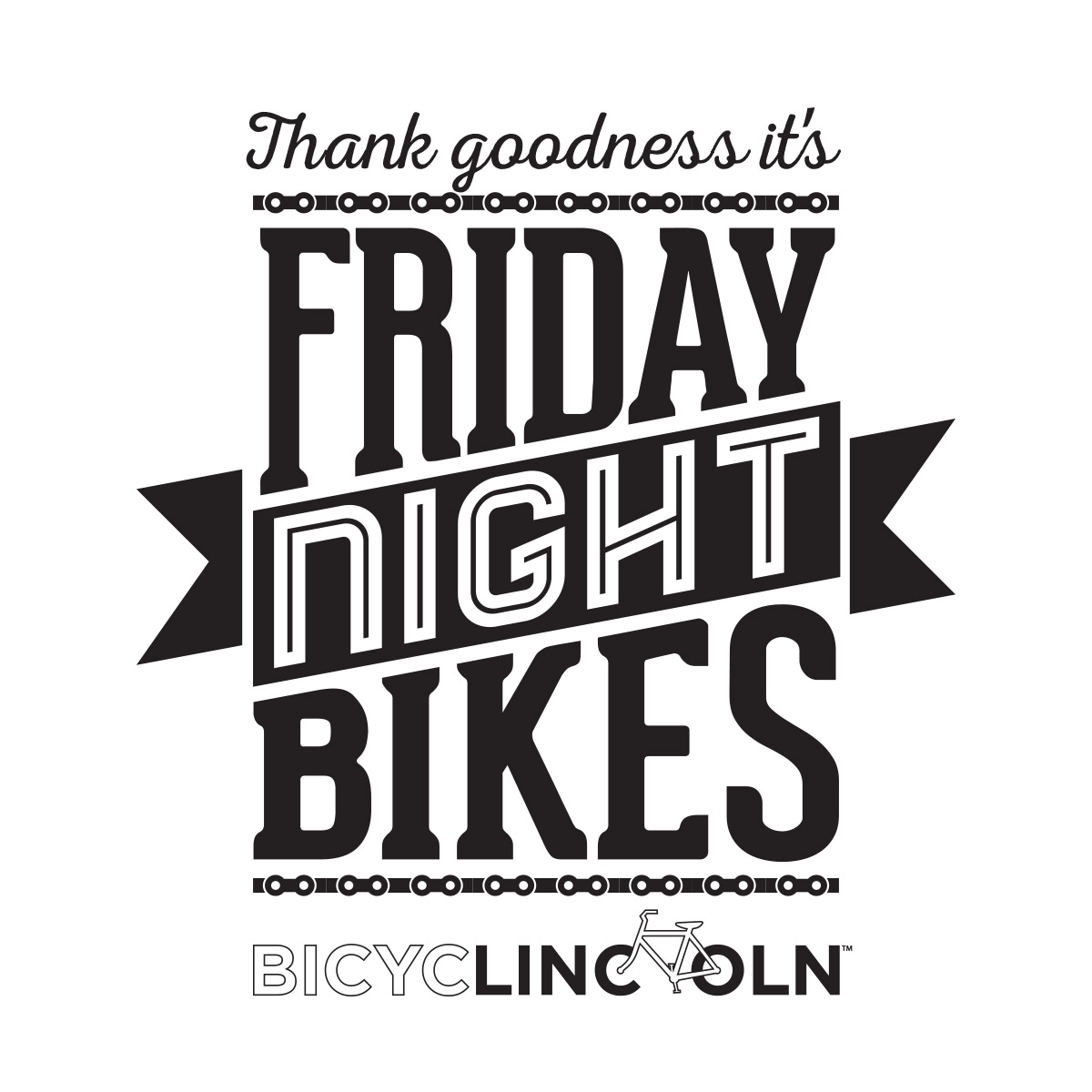
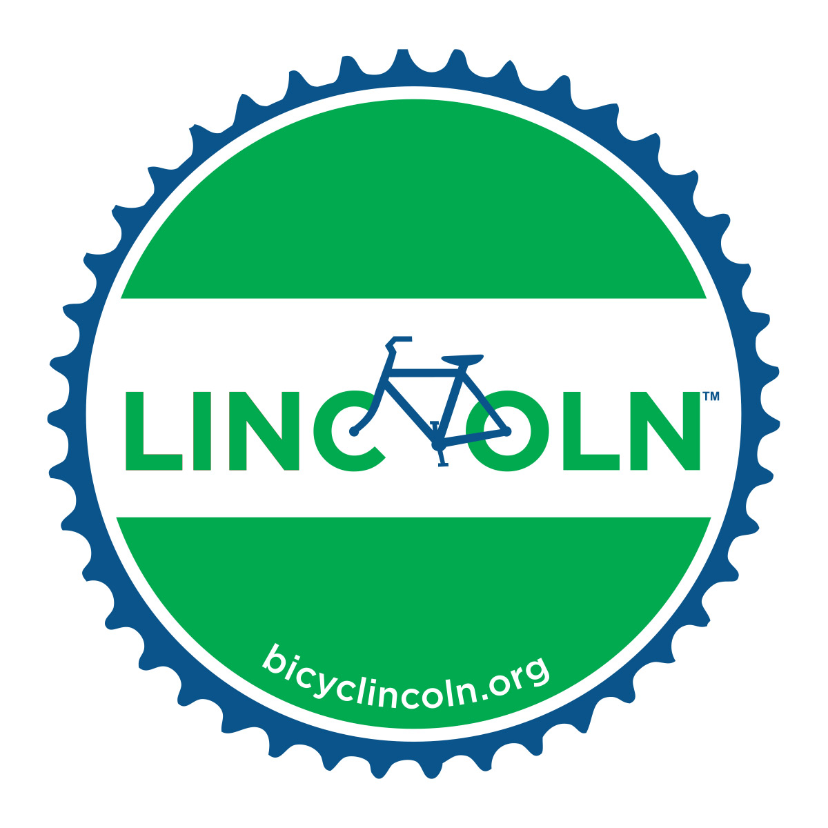
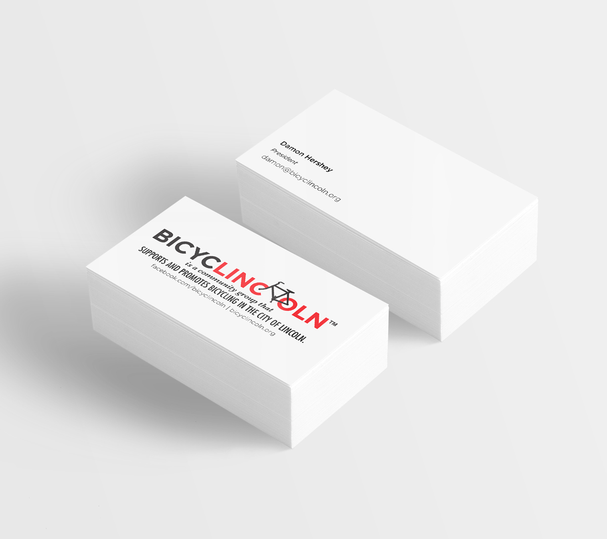
In late 2011, a group of cyclists in Lincoln, NE were starting a new community based bicycle advocacy group. I coined the name “BicycLincoln” and created the brand and marketing materials. I created the logo based around the letters C and O as the wheels of a bicycle. I wanted people to be able to separate the words “bicycle” and “Lincoln” as they saw the logo, to reinforce the name and concept behind it. I was able to achieve this in one color by using solid letters on one half, and outlined letters on the other. The bike is always meant to be the “opposite” color as Lincoln.
The branding has helped BicycLincoln to gain recognition, and they have had great success in getting people organized and raising awareness.


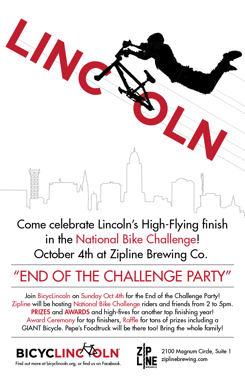
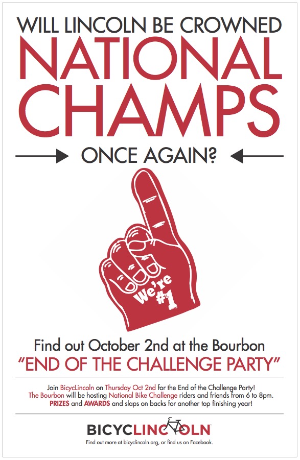
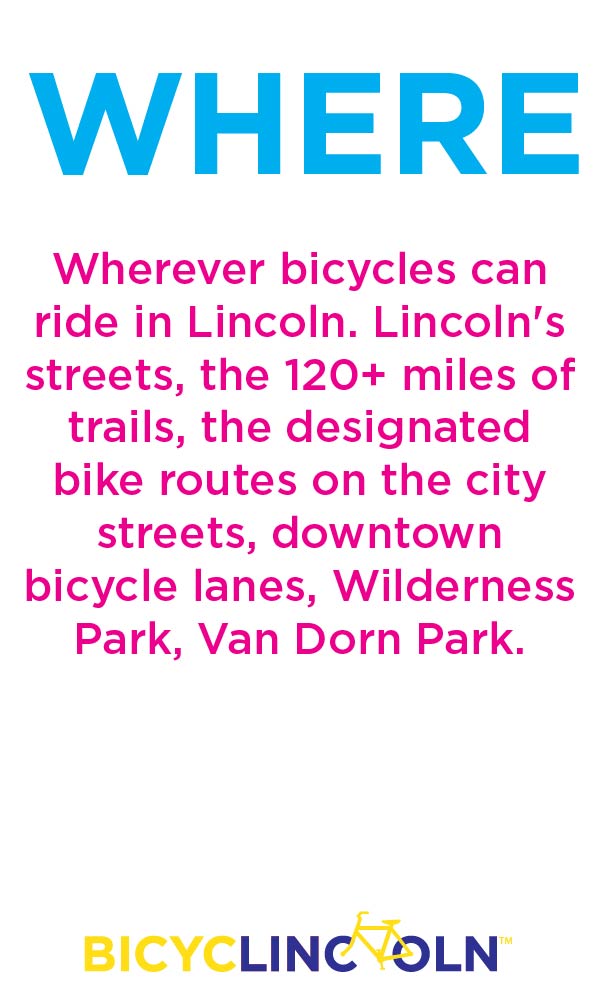
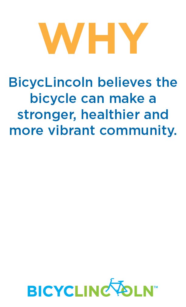
Roll-Out Party informational posters:

(roll over for navigation)
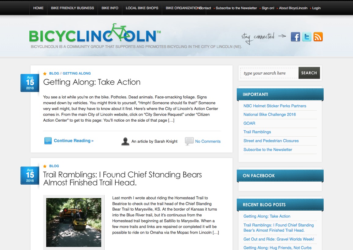
Digital & Social Media
Facebook banner image (during launch)
Collateral
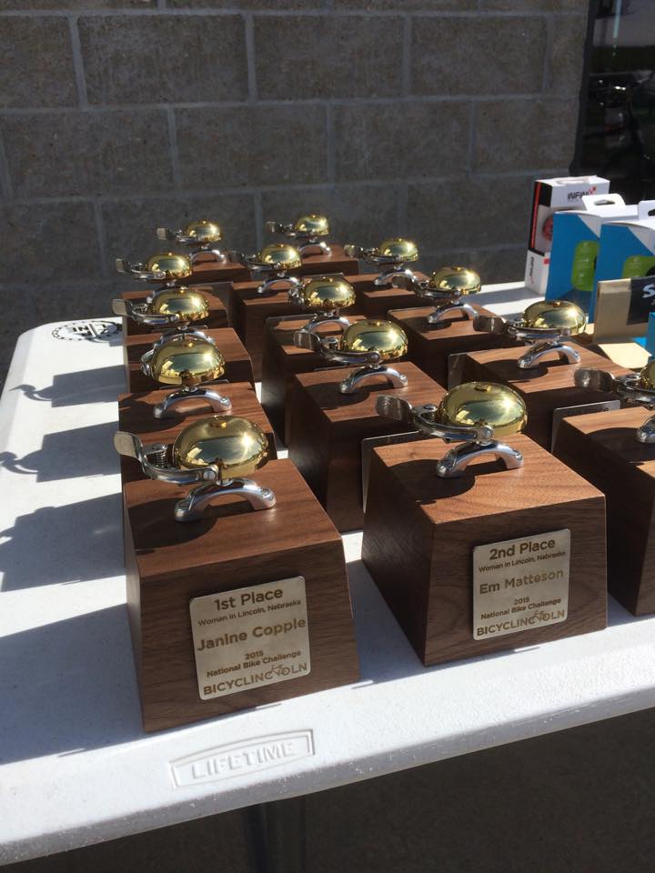
Trophies designed by TMCO

Like what you see?
Contact me today and we can get started on your project soon.