Las Fincas Coffee Packaging Redesign
Role: Designer
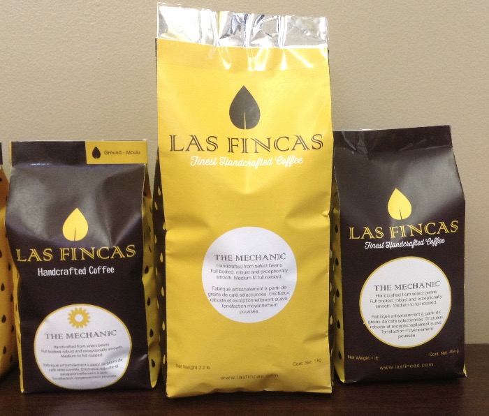
Las Fincas came to me with a desire to revise their branding, and reboot their coffee packaging to reflect changes in their approach and market. They needed a flexible bag design that could be used for a variety of roasts, labels to indicate the blends and whether the coffee was whole bean or ground, different sized bags for retail and wholesale, and a box design for shipping. The bags also needed to be bi-lingual in English and French, so appropriate use of space was a big priority.
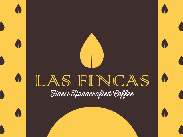
We started by revising the logo with a slight tweak to the leaf/bean icon, and adding the tagline “Finest Handcrafted Coffee”. Then I re-envisioned the design of the 1lb. bags. Using the brand’s yellow and brown palette, I created an eye-catching design that would stand out from other coffee on the shelf. The idea behind the blend names came from the client’s love of Formula One racing, and creating the icons using variations on the leaf/bean was a fun design challenge.
Done for: SMBLX
 Bag mock-ups mid-process. Waiting on final packaging.
 Yellow design for the 2.2 lb wholesale bags.

Brown design for the 1 lb retail bags.
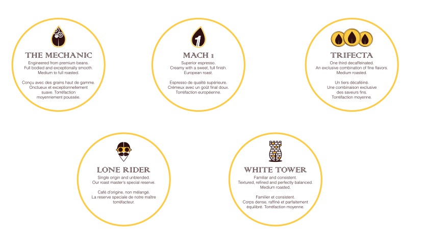
Label designs.
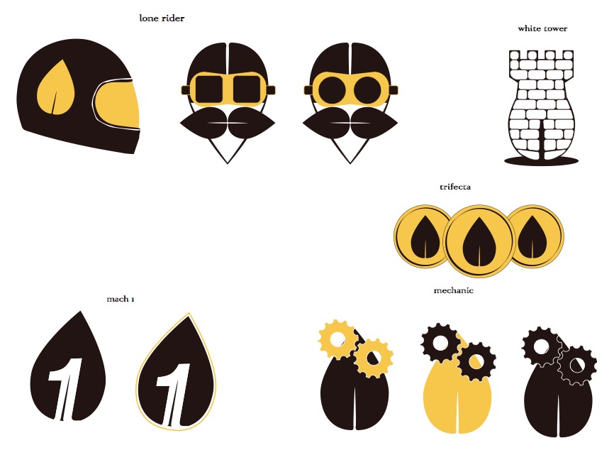
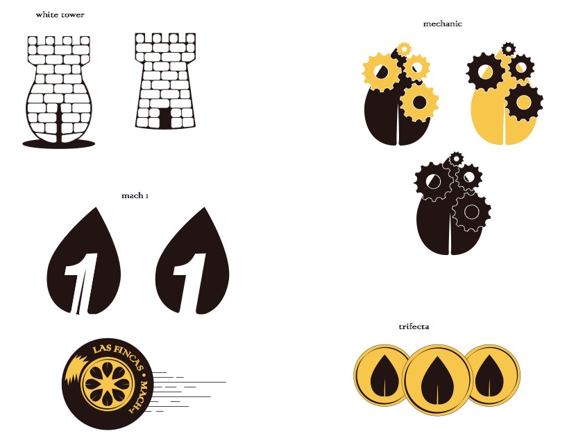
Icon design process shots- variants and unused ideas.
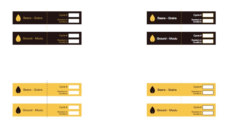
Beans / Gounds labels for the top closure of the bags.  Shipping box print design.