Method Cycles & Craft House Brand Creation

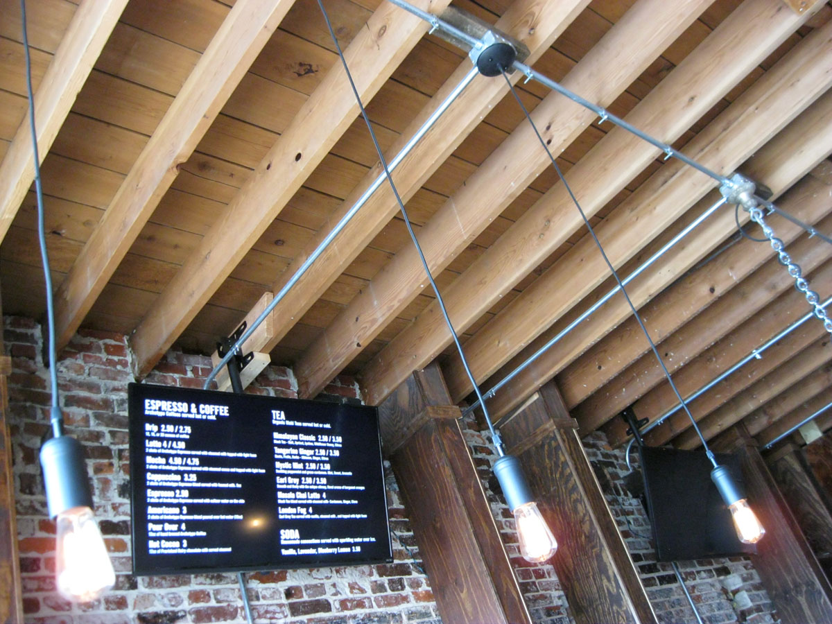
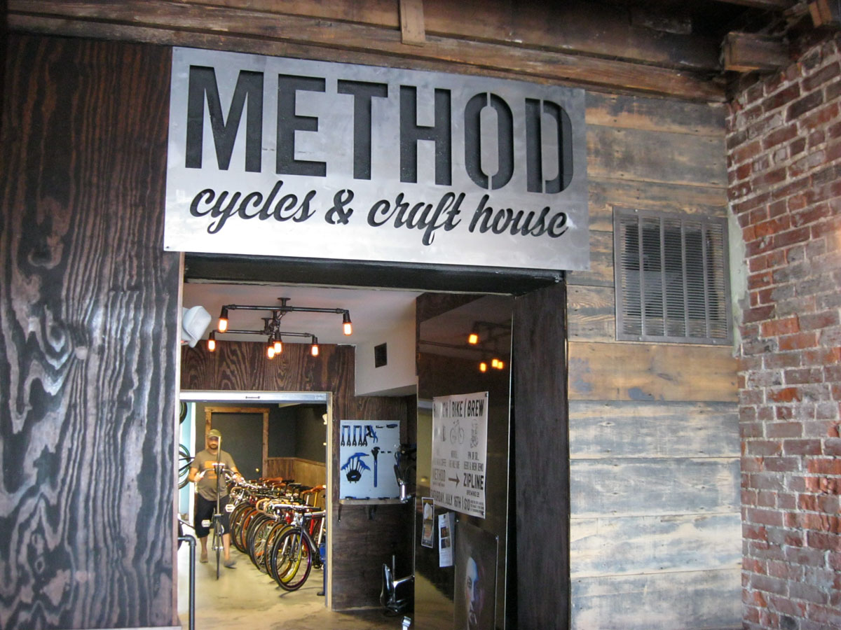
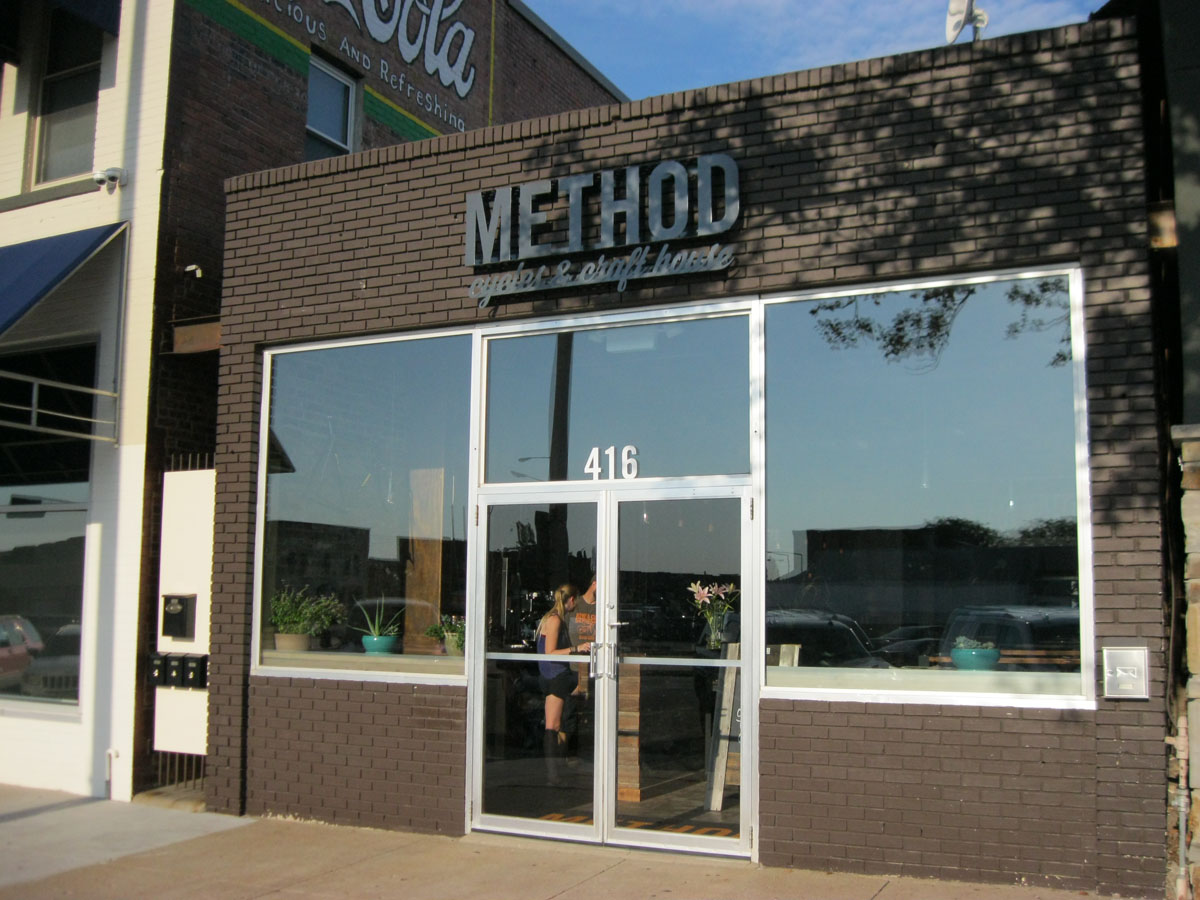
Method Cycles & Craft House is a new business in downtown Lincoln, NE. It’s a multi-function space that includes high-end coffee and espresso, bicycle retail and repair, and (soon) craft beer. It’s a kind of “bike cafe” space. The look of the space is exposed brick and roof beams, salvaged wood, and raw metal. The branding needed to look high-end while maintaining an accessible vibe for a neighborhood stop-in. The storefront gets plenty of walk, bike, and drive-by traffic, so it needs to be instantly recognizable as unique.
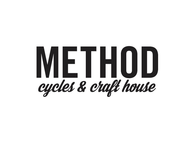
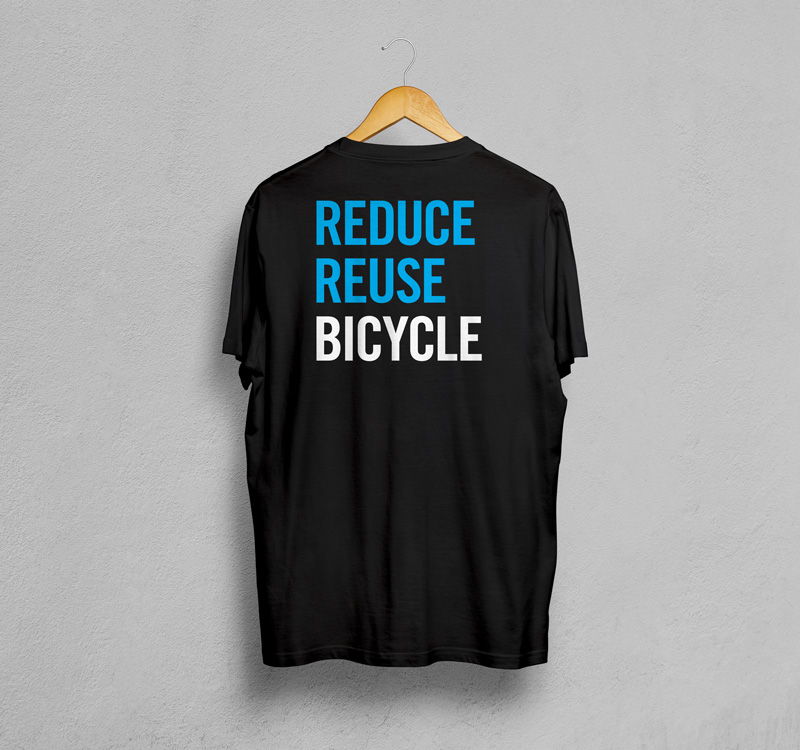
I developed a brand design package that includes a master logo (above), alternate logos, icon, typeface selections, and a variety of additional designs to be used on anything from coffee cups to apparel. The brand is adapting to the space, and the additional options are being incorporated gradually.
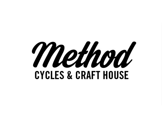
Alternate logo, swapping the typefaces.

M icon.
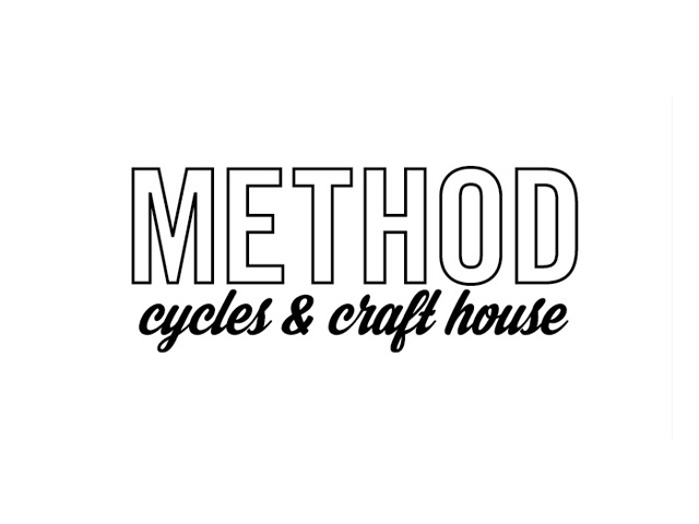
“Master” logo in outline, for when a softer look is desired.
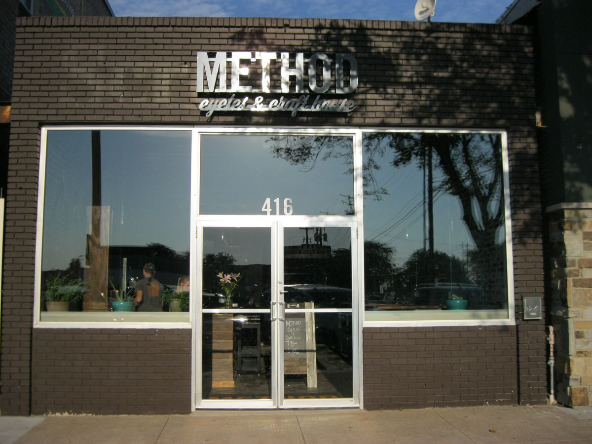
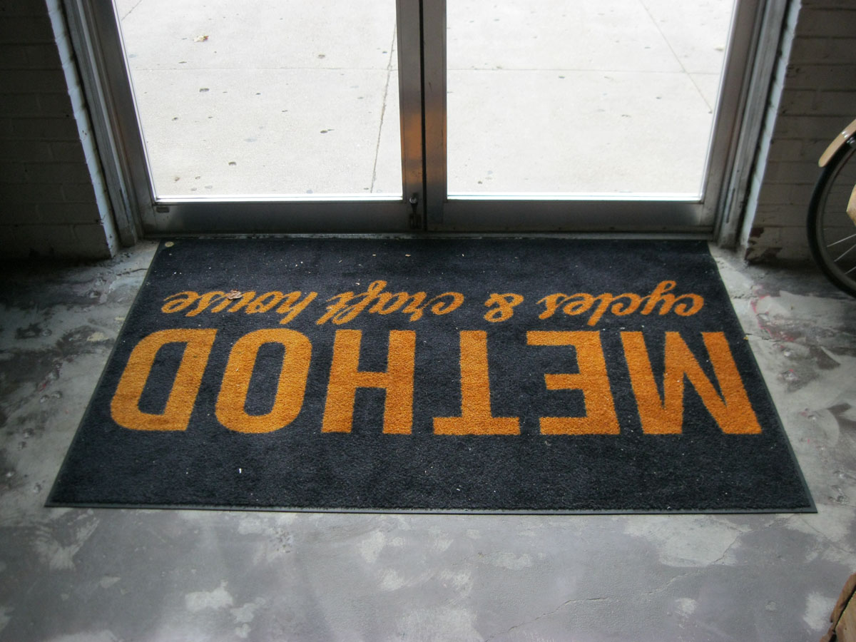
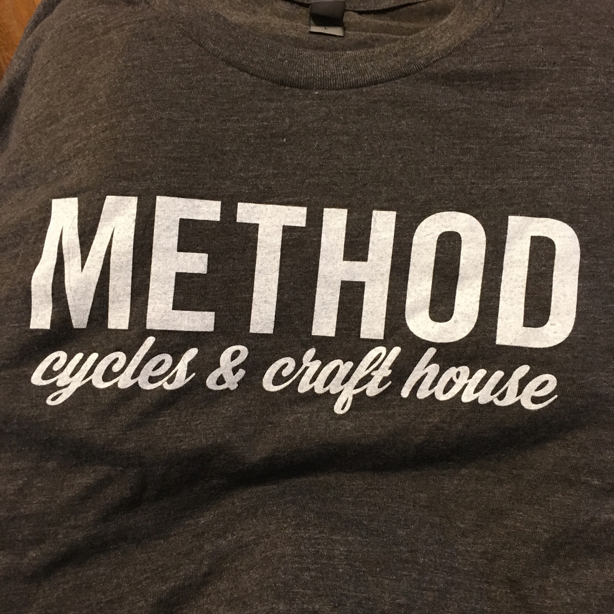
Unaltered photos of the brand in use:
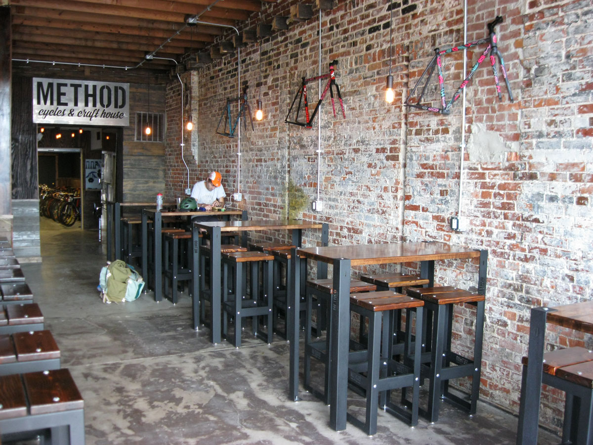
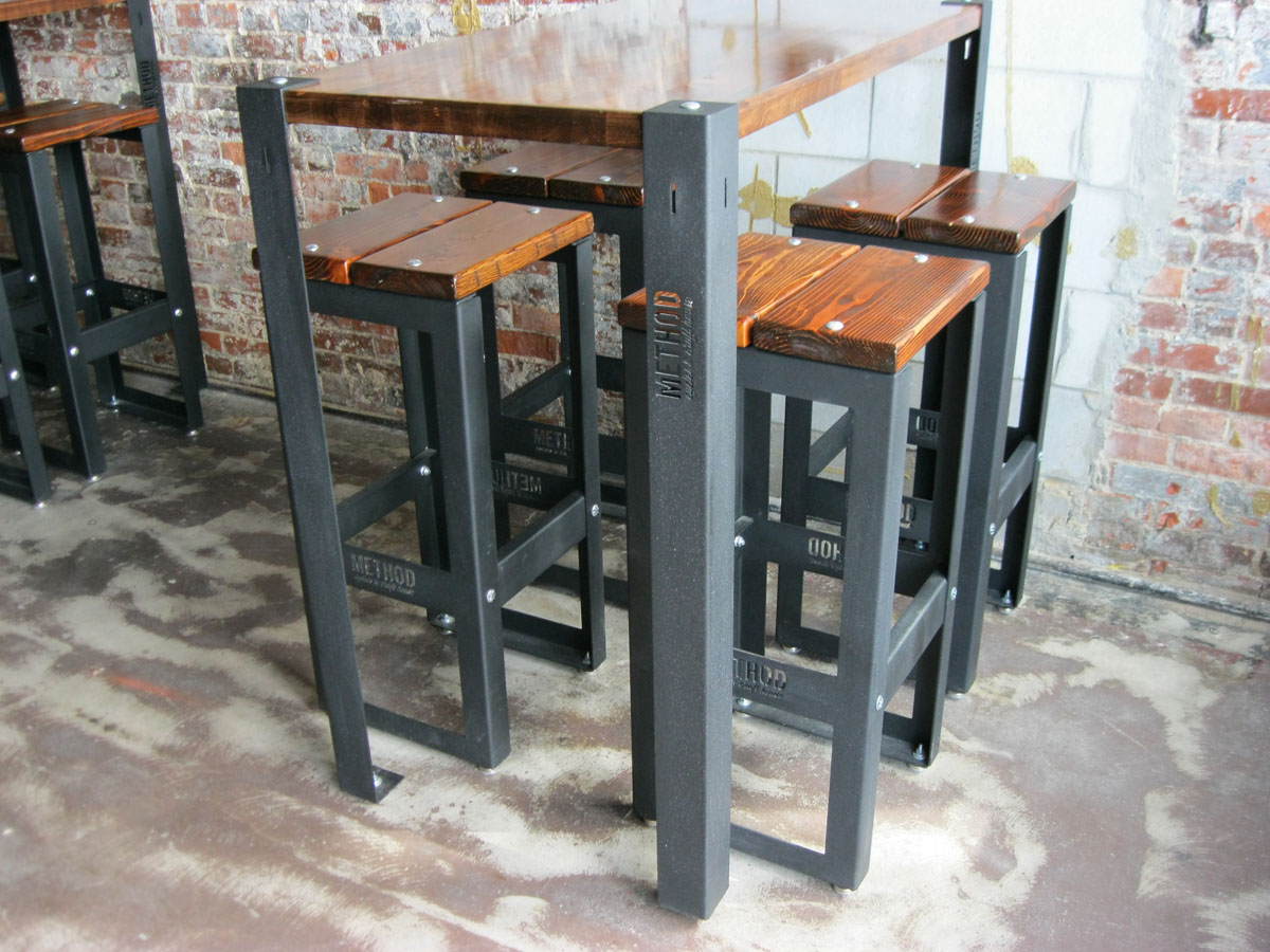
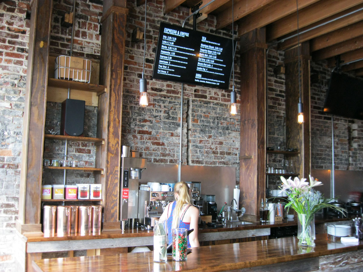
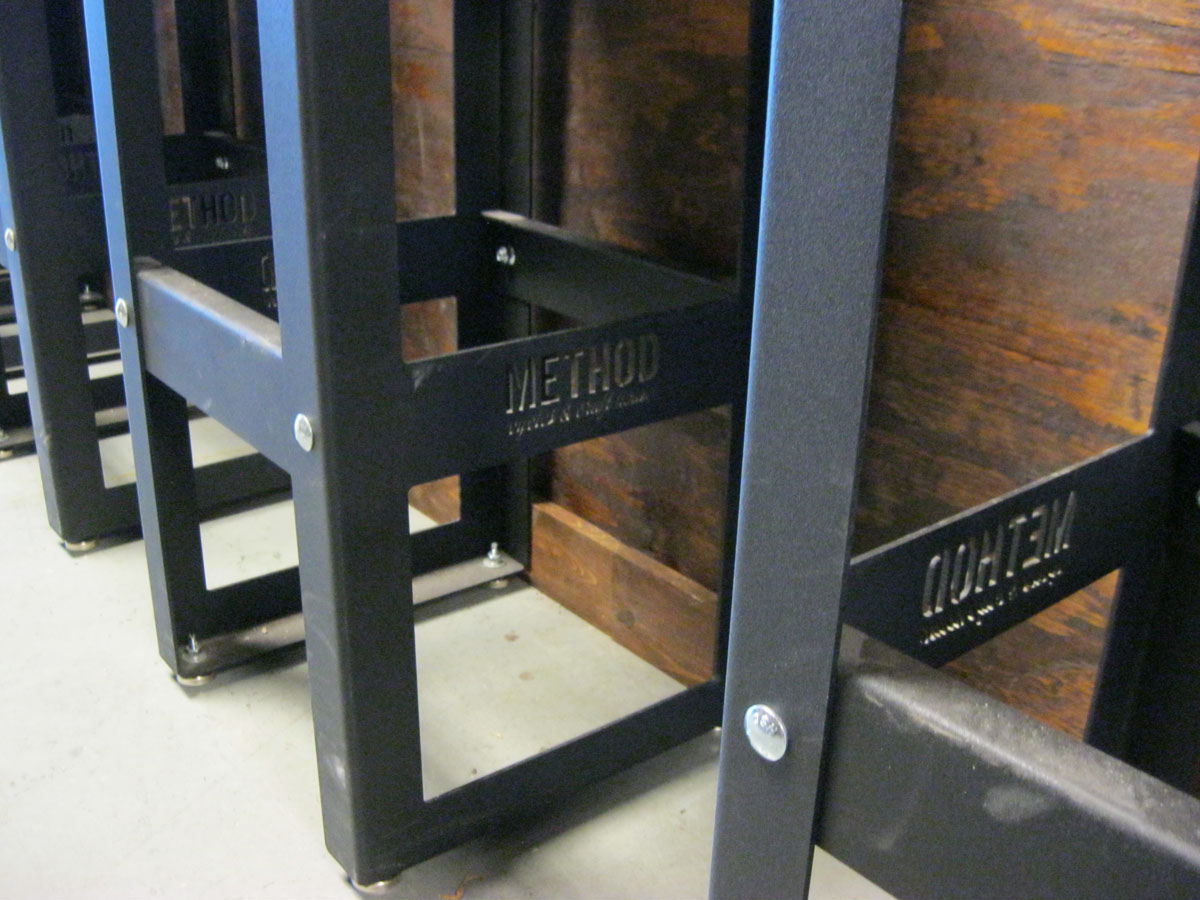
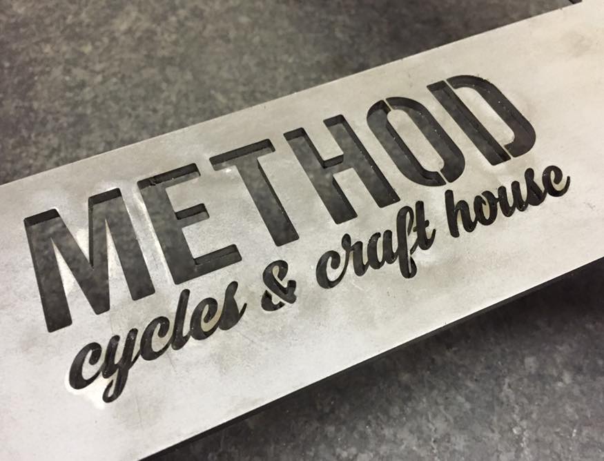
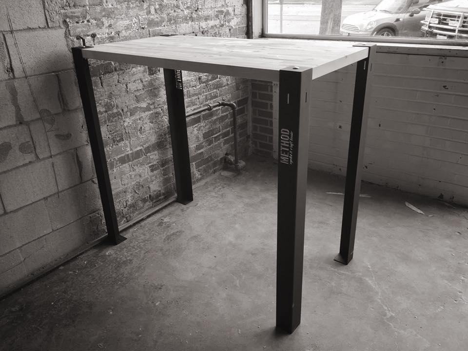
Additional photos of the brand in use:


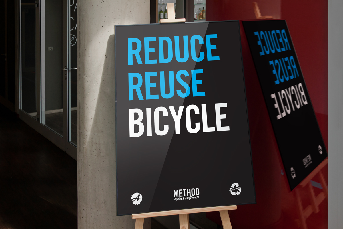
Earth day cross-promotional graphics for Method X Black Market:


Like what you see?
Contact me today and we can get started on your project soon.